i am pretty much obsessed with the finished product of this condo makeover i designed last month with one of my favorite design partners, mr. tommy rouse! tommy is a designer/art director (also from abc's extreme makeover: home edition) who i have worked with for years on many television shows and 20 something homes later. he's a gem! spunky, playful taste with a graphic design background and one of my dearest best friends. between tommy, his partner joshua who is an artist, my boyfriend kristopher and i, it was one power couple duo. we quickly made over the condo in about a month, from start to finish.
our client was the wonderful lindsay kugler. she is a super chic "lady boss!".... what i like to call her! she has been in the industry for a long time and is currently the executive producer for fox's kitchen nightmare. first and foremost, she was a dream to work for! maybe its because she gets designers + art departments and knows how much we live, breath design and work our butts off, but she really trusted tommy and i to take her brand new empty condo and create whatever we dreamed up for her. she gave us a budget and a task to whip something up. and that is exactly what we did!
pre project i had yet to meet lindsay until our first design meeting, and instantly loved her personal style! which is always a plus. she was a woman of my own heart... wearing an adorable madewell top, sleek black vince pants, chanel flats and great house of harlow jewelry. i mean, enough said :) a simple girl with a grrrreat sense of style. she had the fashion sense on lock but when it came to her casa, she wanted some help. our ultimate goal was to bring her sense of style into her new home.... simple, playful elegance. and luckily for us, she gave us full reign.
of course we started with the essential....
favorite colors? colors that make you cringe? style? where do you shop? favorite smells? hobbies? travel...favorite cities, countries? where do you wish to travel to one day? what inspires you?
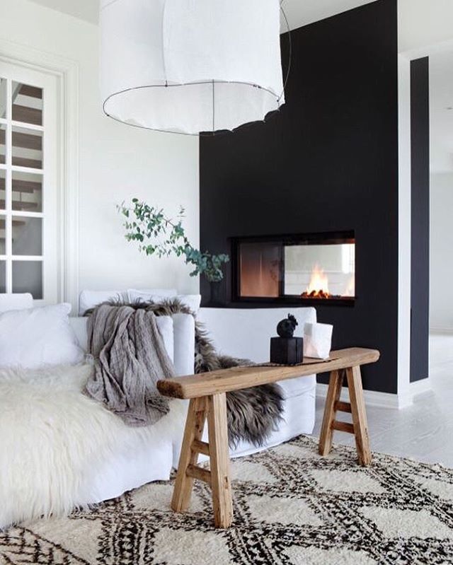
ultimately this is what we designed off of // a few domino mag inspiration pics, her love for navy, kelly green, neutral greys, art, food, culture, basil, ocean, gardenia, fig, sports and cooking!
part 1 of our design makeover // the dining room + kitchen
apologies i don't have a better before pic but youll get the gist. condo was literally a blank white canvas.
b e f o r e
a f t e r
dining set // was an existing piece of lindsays. to be honest i don't know where it was purchased, but if you are interested in it, please feel free to shoot me an email. we loved the modern lines, especially the rad dining table base, so we decided to keep it!
wallpaper // is from the ever amazing trove wallpaper! we've used them before on past projects and pictures truly do not do it justice. their wallpaper is phenomenal lifesized water color beauty. every single one of their wallpapers is a work of art. we decided to go with the enyo line. the enyo line comes in 5 different color ways and collectively we loved the blue tones for the space.... which you'll see in later pics we carried the shades of blue throughout the space. all i can say is when the wallpaper went up it was a total game changer! tommy and i did a crazy happy dance, shouted like children, high five here, high five there and then went back to work.
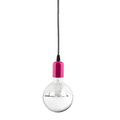
chandelier // the glass orb chandelier from west elm, was the perfect modern/edgy balance to the room
area rug // we went with the ombre dye wool rug from west elm i loved how the deep blue shades balanced and brought out the wallpaper in the space.
white + metallic gold plates // organic shaped dinnerware from west elm these are an amazing staple and everyone should have a set of them. their simple with a splash of elegance. a perfect paring with the gold silverware below :)
sexy gold silverware // also from west elm i only want to eat from gold silverware now.
paper placemats + accent appetizer plates, bowl and cups // all from anthropologie
the glorious brass bar cart // is the libations bar cart from crate and barrel if you have room in your home for a bar cart, get one.... and get this one if you can! it's a great way to display your liquor and snacks for parties and the combo of the brass with the leather handles is to die for.
art work // this was a piece that lindsay had purchased from one kings lane. we needed a piece of art work for above the bar cart and it was the perfect fit.
all accent cups and bowls // are from anthropologie
our industrial bar stools // we went with the bright tomato red ribbon bar stools from west elm. a majority of our walls we left white and we wanted to bring some more excitement over to the kitchen area. these seemed to do the trick.
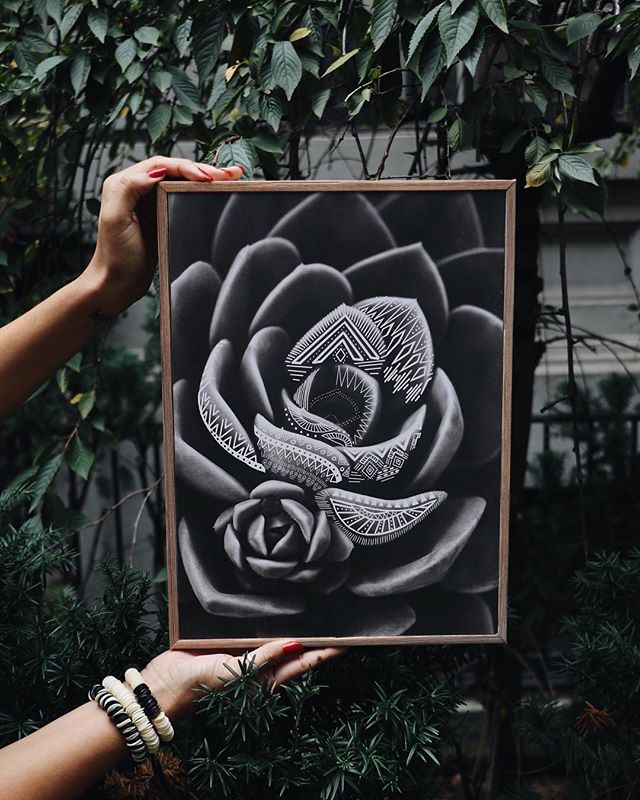
custom chalkboard art work // in the kitchen we really wanted to bring a sense of cooking and warmth to the space. so on top of our wall of herbs, we had josh make custom chalkboard art work. we talked it out and it took him half a day to whip them up! i think they turned out great and really filled out the space nicely. you can check out more of of josh's work here!
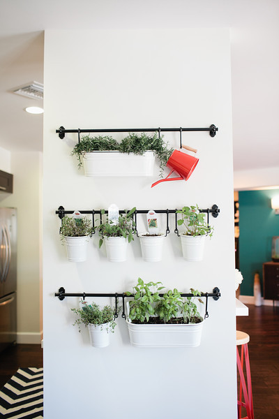
our mini herb garden display // all of the containers and brackets were purchased from ikea.... it was all sold separately so we were able to lay out what we wanted for the wall. it came out great and i will now officially be doing this in my home! hoping it will inspire me to be the most awesome master chef!
a lot of our other accessories you see in the pics, were purchased at the go to spot when in a design rush.... drum roll please, homegoods!
all floral arrangements and plants // were created by willow and jade and last but not least our sexy hot pink door is by benjamin moore // color: blushing red 2079-20 with one of my fave hooks of all times we used for a cooking apron, the cutest brass deer head from anthropolgie.
all paint // was purchased at jills paint in atwater. if you live in or around the atwater area, i suggest you go to them for all of your paint needs. store has a cool vibe, everything is laid out nicely and employees are helpful and awesome!
well, that concludes part 1 of lindsay's casa. tommy, kristopher, josh and i had so much fun on the project...i mean don't get me wrong it was stressful at times just like any other project but it did seem to go by like a breeze. can't wait to share more designs from her home. xo
photography of the home by // love ala
