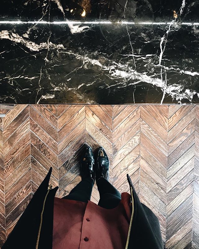
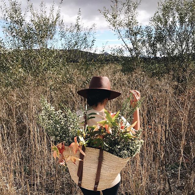
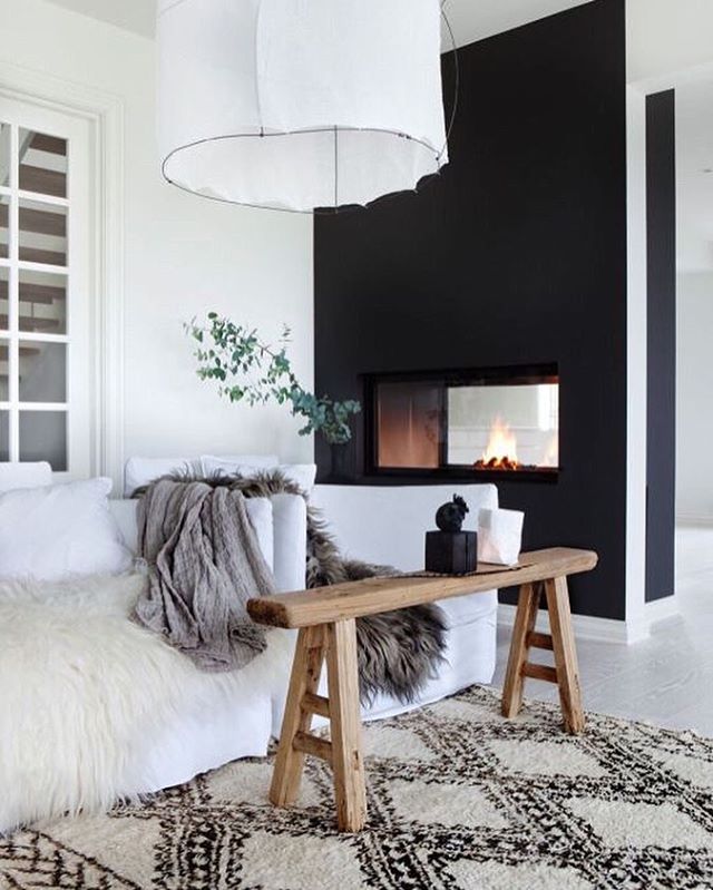
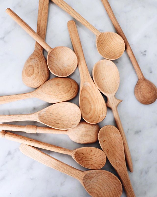
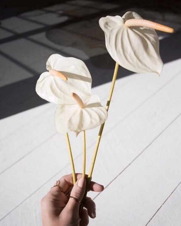
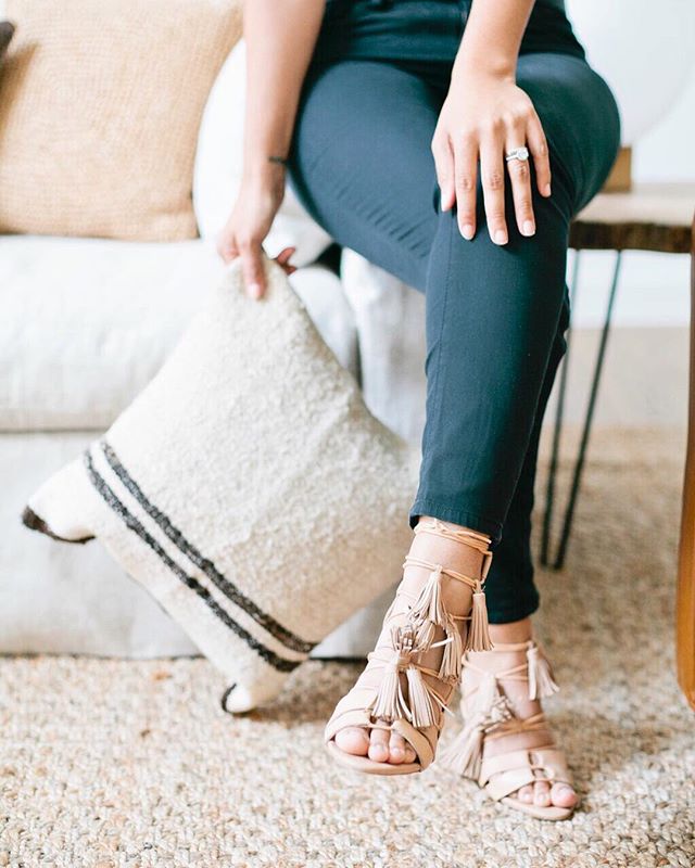
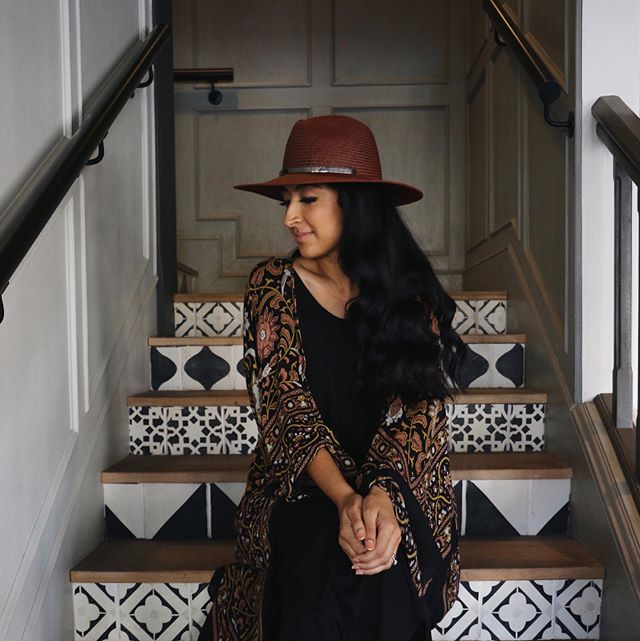
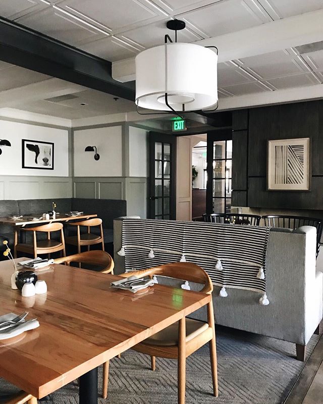
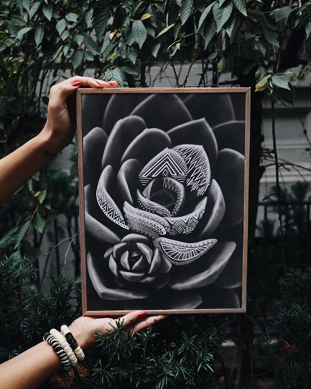
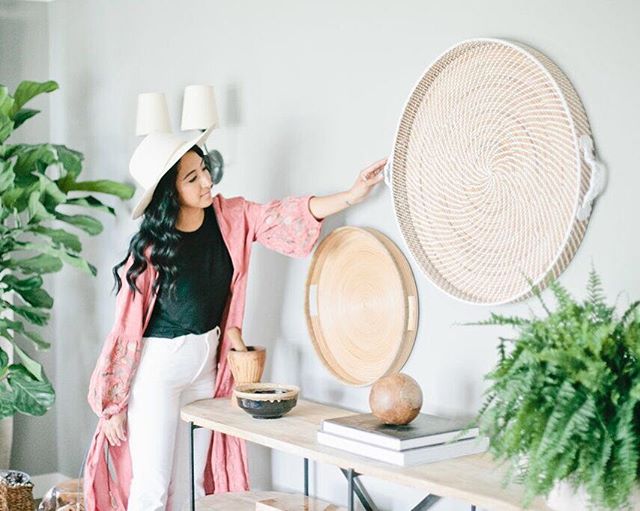
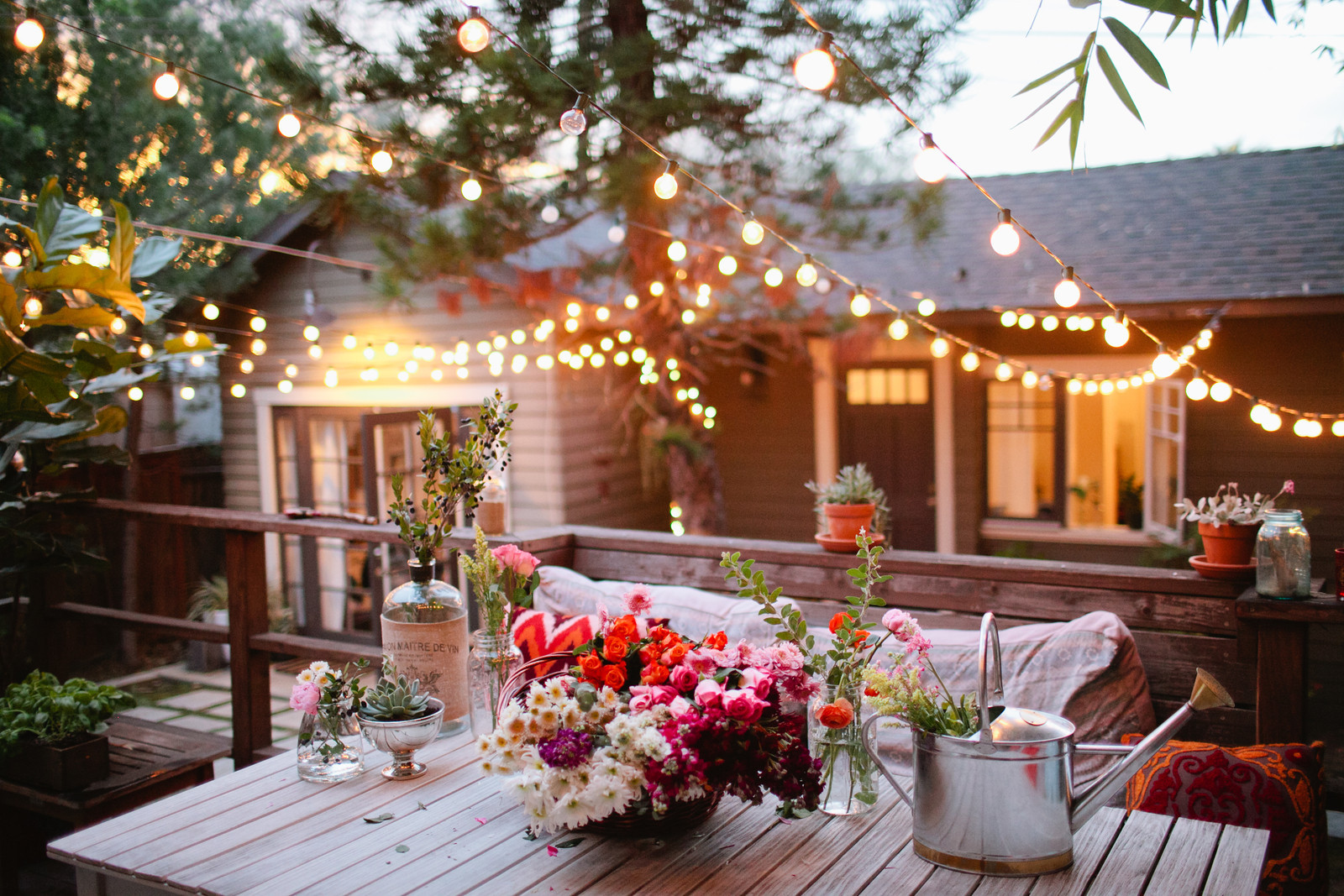
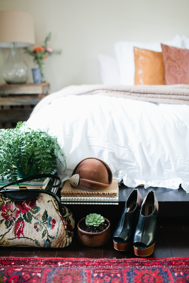
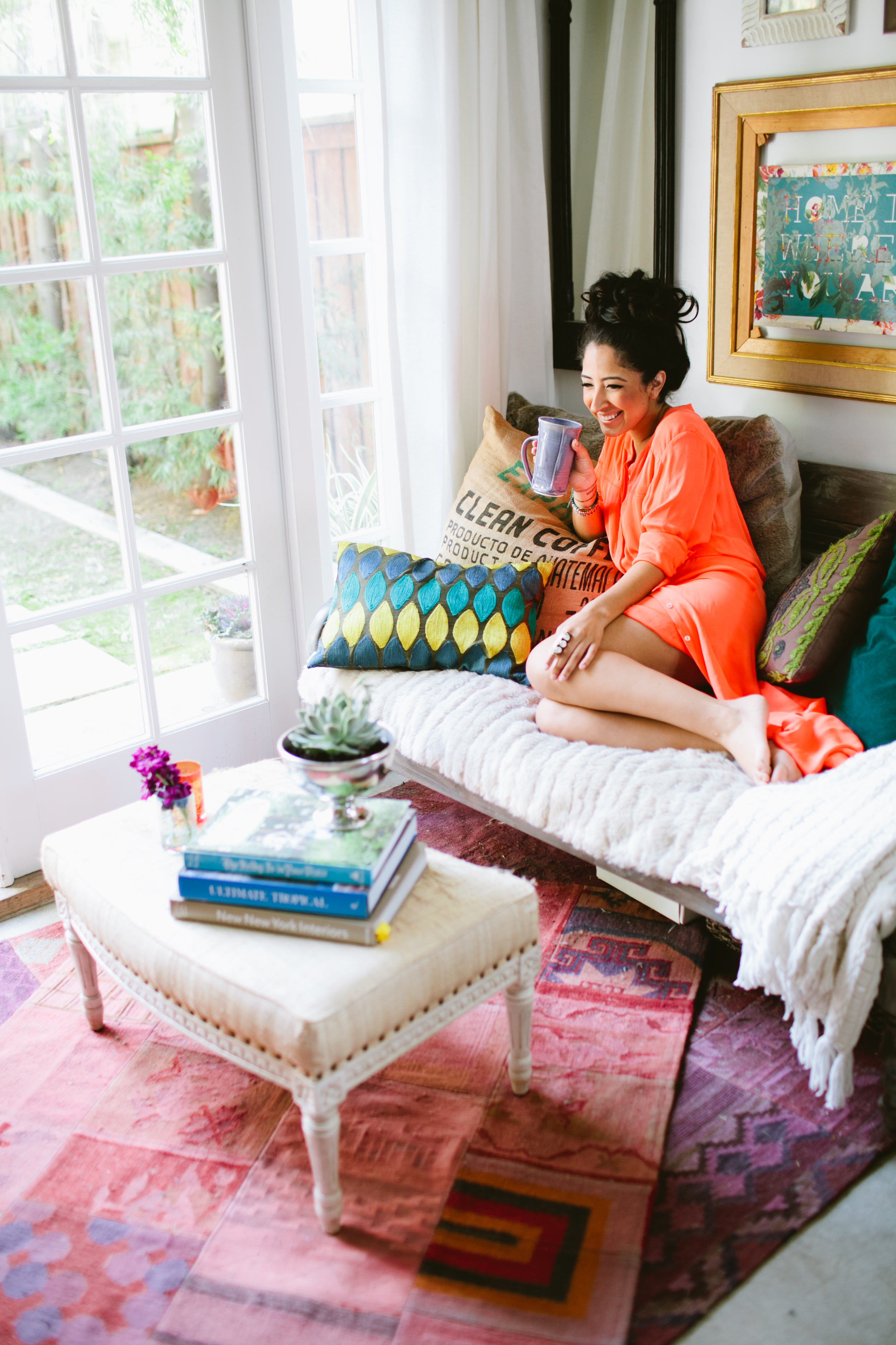
now this is my kind of color forecast. check out the styling for australian company, haymes paint. their look book for '2015 colour expressions forecast' is so on point. both beautiful and captivating. i love how they really took it to the next level with telling their color stories, styling and photography. oh so inspired right now....
starting off with "rhythmic palms", because welp, who doesn't like palms that have moves.... not to mention this color palette in particular so happens to be my favorite from the 2015 launch. enjoy!
Rhythmic Palms explores the notion of escapism and replenishment through a deep, rich palette that amplifies colour and pattern. See more here.
Raw explores the notion of detoxification - cutting out the clutter - and redefining what is important through a process of natural selection. See more here.
New Skin travels from mineral pastels through to deep blues and greys, illustrating the natural erosion that comes with overuse - just like a pair of jeans. See more here.
Exotic Botanic takes us back to our roots, provoking a reawakening of the senses, returning to nature and exploring the vibrant beauty it has to offer. See more here.
Relaxed Replay takes on a nostalgic feel, stepping back in time with a vibrant, bold and effervescent palette. See more here.
all images courtesy of haymes paint
